Sound Transit: Real Time Crowding
My Role
Design Research
UX Design
Team
Myself Independantly
Organization
Sound Transit
Timeline
January 2023 - March 2023
Project Overview
As a UX Design Intern at Sound Transit, I spearheaded a project focused on the integration of real-time crowding information into our digital platforms, aiming to elevate the rider experience by providing transparency about train occupancy levels.
Problem: Crowded Trains, frustrated riders
Public transit users often lack real-time information about train crowding levels, leaving them unable to make informed decisions about their travel. This absence of crowding data leads to inefficiencies, dissatisfaction, and challenges in personal comfort, safety, and operational efficiency.
Delivered actionable design components and mock-ups to leadership.
Proposed designs informed Sound Transit’s long-term project roadmap.
Created a plan for user testing to refine components and validate their effectiveness.
Was called "the best intern ever" by a Sound Transit project manager.
Competitive Analysis
Surveyed the landscape of real time crowding across the world to benchmark against existing solutions.
The Riders Journey
Identifying high-impact areas in the digital experience where crowding information could benefit users.
Skewmorphic design
Designing components that make sense within context and use a visual language associated with transit.
Integration
Use the existing design system, technology, and stardards to integrate the feature using atomic design and mock ups.

How Might We…?
Effectively integrate real-time crowding information into Sound Transit’s digital experience to improve user satisfaction and decision-making?


To create an effective solution, I conducted in-depth research to understand industry standards and user needs:
Competitive Analysis
Examined five transit agencies known for integrating crowding data.
Identified varied approaches to displaying crowding levels, from simple icons to complex percentage-based systems.
Highlighted gaps, such as a lack of accessibility-friendly designs in many solutions.

Journey Mapping Insights
Pinpointed critical moments in the user journey, such as trip planning and real-time arrivals, where crowding information would have the most value.
Found that users habitually check these points for trip details, making them ideal touchpoints for crowding data.

Key Research Findings
Crowding information is most effective when integrated into existing workflows, such as trip planners and route schedules.
Users prefer multiple modes of communication (text, icons, and colors) to ensure clarity and accessibility.
Real-time updates combined with historical data enhance user trust and usability.
Inconsistent Standards
Transit systems lacked a unified approach to displaying crowding levels, making it difficult to identify best practices.
Accessibility
Many solutions relied solely on color-coded visuals, limiting usability for colorblind or visually impaired users.
Granularity vs. Simplicity
Balancing detailed train car-level crowding information with an interface that remained easy to understand.
Using the research findings, I designed components that seamlessly integrated crowding information into the Sound Transit website while addressing the challenges identified:
Core Features
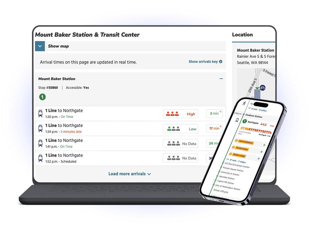
Crowding Indicators: A 3-level scale (e.g., light, moderate, heavy) communicated using icons, text, and color for clarity and accessibility.
Detailed Train Car View: Granular data showing crowding levels for each car, aiding users in selecting less crowded areas.
Integration Points: Designed for inclusion in trip planners, real-time arrivals, and stop viewer pages to meet users at key decision-making moments.
Accessible and Scalable Components
Built in Figma using auto-layout for consistent spacing and sizing.
Incorporated feedback to refine iconography, colors, and text styles for enhanced usability and alignment with Sound Transit’s existing design system.
Developed two versions: one with color-coded crowding levels and one with minimal color to increase contrast and accessibility.
High-Fidelity Mock-Ups
Created polished designs for trip planners and stop viewers, providing a clear vision for leadership and future implementation.
Mock-Up Integration

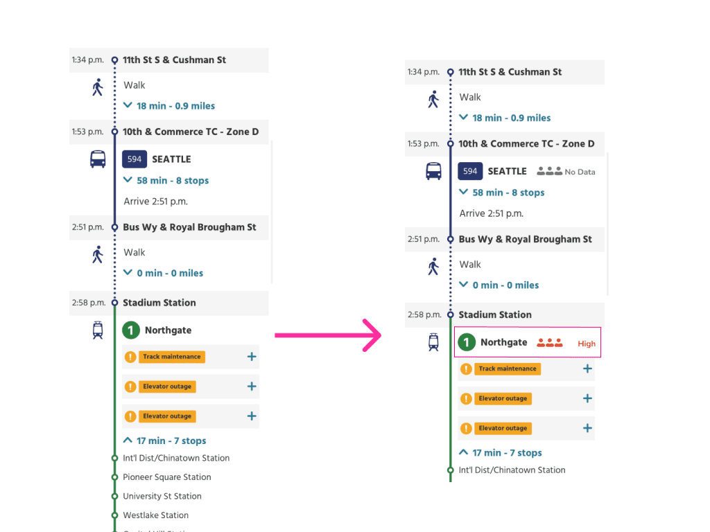

Trip Plan View of Low Crowding
Above is a mock up of the trip plan view showing low crowding. The top icon represents an overall crowding level while the train icon shows car level crowding.

Trip Plan View High Crowding
Above is a mock up of the trip plan view showing high crowding. The top icon represents an overall crowding level while the train icon shows car level crowding.
I was not personally able to see through the testing phase before the end of my tenure at Sound Transit. A sample of recommendations for testing the design components and areas of integration are as follows.
Task analysis:
Tasks:
Find out how crowded the next train is
Compare the crowding levels of different upcoming trains
Locate detailed information about crowding such as where the least crowded car on the next train might be.
Survey:
Rate how easy or difficult it was for you to understand the crowding levels.
Rate how easy it was to find information on crowding on the trip details page.
Rate how easy it was to find crowding information on route pages.
Provide feedback on which visual cues helped most in understanding the crowding information.
Do you have any other feedback on real-time crowding information?
“Small features, big impact” Real-time crowding data, when thoughtfully integrated, can transform the transit experience.
Accessibility Matters
Designing for all users enhances usability and inclusivity.
Clarity is Key
Simplified visuals and multiple communication methods improve comprehension.
Target High-Impact Moments
Focus on points where users actively seek information, like trip planners and real-time updates.
This feature can easily be tested with users at it's current stage.
Use task analysis and think-aloud walkthroughs to evaluate the design’s effectiveness.
Now that the components are spec'd and ready to go and the feature can be tests, the bottleneck is the data collection tech… so it may take a while to fully implement.