Bouquet: Fragrance eCommerce

My Role
Team
1 Design Partner
Organization
HCID 512 - Interface Design Lab
Timeline
Oct 2022 - Dec 2022
Project Overview
This academic project for HCID 512-Interfaces Lab focused on designing a unified desktop and mobile e-commerce experience that redefines the way users interact with fine fragrance retailers.
Problem: Bringing Scent to Screen
I’ve always been a fragrance head—the kind of person who can spend hours reading scent breakdowns on Base Notes, chasing the perfect balance of rose and incense, and experimenting with not for the faint of heart niches. But when it comes to shopping for fine fragrances online? It’s a letdown.
Luxury fragrance is all about nuance, storytelling, and craftsmanship, but most e-commerce experiences feel anything but luxurious. Sites are cluttered, lack cohesion, and don’t capture the sensory magic of scent.
Designed a fully realized desktop & mobile luxury e-commerce experience.
Created logical interactive prototypes using Figma and Protopie.io showcasing key user flows & microinteractions and expanding my skills to draft fully formed end-to-end interactions.
Competitive Analysis
Studying both marketplace retailers and brand sites to identify strengths and gaps.
Information and Content
Designing for two user types: the browsers (who want inspiration) and the seekers (who know what they want).
Aesthetic and Flow
Wireframing & High-Fidelity Prototypes, and style guide, bringing the design to life for both desktop and mobile.
Microinteractions
Using Protopie.io to add fluid, elegant interactions to sign-in, sign-up, and checkout flows.

How Might We…?
Create a seamless, elegant, and modern e-commerce experience for luxury fragrances?

Competitive Analysis
Found that marketplaces lacked cohesive design, detailed product pages, and effective search functionality.
Brand-specific sites provided a better aesthetic but offered fewer products and limited shopping features.
Examined fine fragrance marketplaces and brand-specific websites for strengths and weaknesses.
User Categories
Developed the information architecture to meet the needs of two user types: those browsing for inspiration and those seeking specific products.
Identified key points where users require guidance, such as navigation, product exploration, and checkout.
Insights
The lack of cohesive design creates friction in the user journey.
Users value detailed product descriptions, intuitive navigation, and a visually luxurious experience.


Visual Consistency
Creating a cohesive design that reflects luxury while maintaining usability.
Information Complexity
Designing navigation and content that cater to both exploratory and goal-driven users.
Interactive Features
Crafting microinteractions that enhance engagement without overwhelming users.
Core Design Elements
Visual Style Guide: Established typography, colors, and layout principles to create a unified and luxurious aesthetic.
Microinteractions: Developed detailed interactions for account sign-up, sign-in, and checkout flows using Protopie.io. These include demos of adding items to the cart, changing passwords, and completing purchases.
Information Architecture: Created a site-wide structure that organizes content intuitively for all user types.
Key Features
Homepage to Product Details Flow: Designed a streamlined navigation path for users to explore and evaluate fragrances.
Product Details to Checkout: Enhanced product pages with rich descriptions and reviews to aid decision-making, while simplifying the checkout process.
Sign-Up and Sign-In: Used polished animations and form design to create a welcoming, intuitive user experience.
Prototypes
High-fidelity prototypes for desktop and mobile were created in Figma.
Microinteractions were built in Protopie.io, with demo videos showcasing the flows.
Information Architecture

Wireframes
Each screen for desktop and mobile was wireframed to map out the logical structure of the user journey, critiqued, then iterated upon.

Style Guide
A style guide was established to promote consistency throughout the web experience. Inluding gride, typography, and colors.


Higher Fidelity


Prototyping in Proto.io
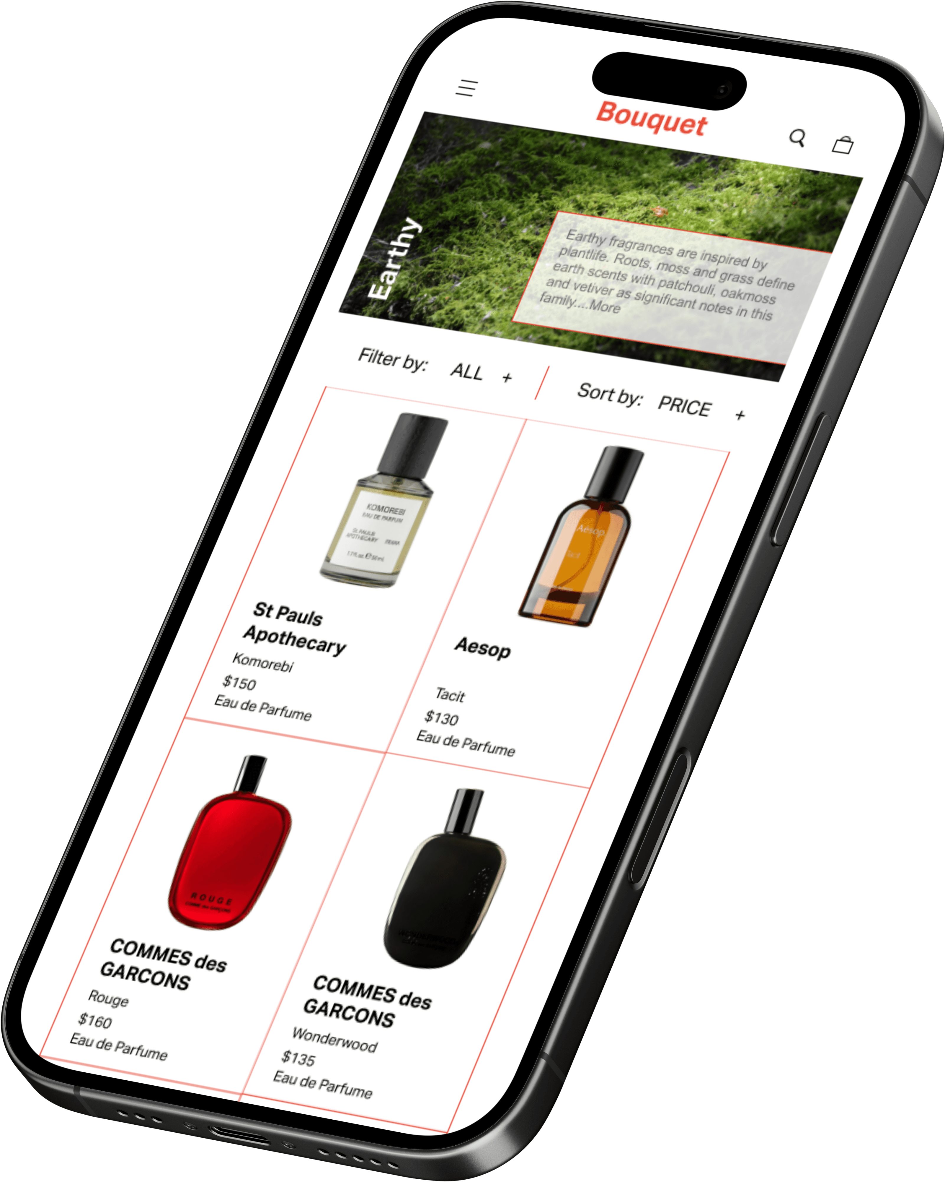
Interactive Mobile Prototype

Interactive Desktop Prototype

Because this was a project more focused on an aesthetic and technical design process user testing was not conducted. Most feedback for iterations was given during formal and informal design reviews and critique by peers and faculty.
Fragrance is having a moment in digital and content culture. This project reinforced the importance of treating every detail as part of a cohesive, artistic whole.
Organization is everything: A well-structured design system is crucial for maintaining consistency and efficiency.
Content is king: Clear and engaging content organization enhances the overall user experience.
Feedback matters: Design critiques are invaluable for improving and refining ideas.
I really want to work on an IRL fragrance based project so if you have ideas for collaboration HMU!